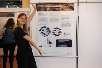
A VIB Conference is a perfect opportunity to present your research to a broader audience and get your work on the map. How do you create a poster that attracts attention and says it all without making it look like an explosion of information?
Christof De Bo is Staff Employee Research Informatics at the VIB Bioinformatics Core, which goal is to provide training and services that contribute to the generation of useful biological knowledge and can give you some tips and tricks on the matter.
“A scientific poster is a resume of a piece (or timespan) of research on one square meter of paper. A poster is best compared to slides for oral presentations, not a written document. Posters can’t convey detailed evidence like scientific articles, but they must visualize a message on their own. When standing one meter away from a poster, you hardly feel like reading much text, especially when the author/designer stands next to it. A poster must bring that message without requiring an oral explanation, with as little text as possible.”
Here are 7 tips on how to get started:
- Corporate identity: Every company or institute has a range of colors and fonts to use for designing your poster. Preferably you use the corporate identity colors scheme when drawing figures and designing graphs. Your institute also might have a scientific poster template with these elements in place.
- Text vs. Images: The ratio for text vs. images (incl. graphs and tables) should be around 50/50. A poster is not a large copy of your paper, it is a visual representation of your research. The more visual aspects, the more accessible a poster will become.
- Fear of emptiness: Not every square centimeter of your poster has to be filled with text, images, or a color. White spaces between objects make it easy for the public to read your story. The more objects you import into your poster, the more they will lose their value. Only incorporate the essential information and add text to explain more in detail.
- Layout: You have several ways to highlight objects in your poster; size, color, shape, and position. As a designer, you’re in control of how you convey your message, which items have priority, and which don’t. High-priority items are more oriented to the left or to the top of your poster. For text, you can use a bold typeface to highlight words and titles.
- Image quality: When importing images in a poster, make sure it can be printed at a high quality (300 DPI). Nobody likes blurry pictures with visible pixels.
- Drawing figures: Using figures in your poster is a must, using attractive figures is even better. When drawing pathways, protein interactions, and cells, try to avoid sharp objects, think of a peaceful color scheme, and make it look professional. PowerPoint may be easy but limits your creativity.
- Try it out: When your poster is complete, try to explain your research using your poster to a friend, family, or someone else who has no scientific background. Use their feedback to perfect or re-design your poster.
"A good scientific poster is a visual storyline of your research that everyone can understand." - Christof De Bo
Should you want to look into the do's and don'ts of communicating even more, we can refer you to the book Trees, maps, and theorems of Jean-Luc Doumont.
Let's get started on that poster!
Check out the abstract deadlines for the upcoming VIB Conferences here:

